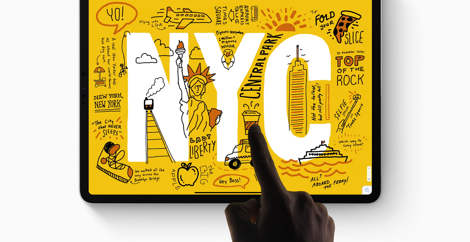
The new iPad Pro features an all screen design, featuring a screen that takes up a lot more space on the device than it traditionally used to. This presents a great opportunity for your app to be more immersive for users that are no longer hindered by thick bezels and a home button.
The new apple pencil makes it more intuitive to interact with your app through the new double tap feature. People can now interact with your app without even touching the screen.
Pixels and Points
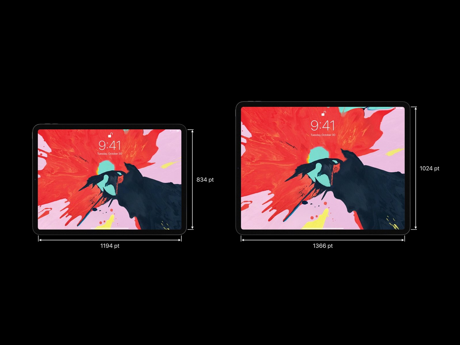
The 11 inch iPad Pro display is 1194 pt x 834 pt at 2x resolution. In pixels that is 2388 px x 1668 px.
The 12.9 inch iPad Pro display is 1366 pt x 1024 pt at 2x resolution . In pixels that is 2732 px x 2048 px.
The 12.9 inch iPad Pro is the same width and height as the previous generation device. The 11 inch iPad Pro is the same size as the 10.5 inch iPad Pro but has an extra 164 px.
The Rounded Corners Cometh
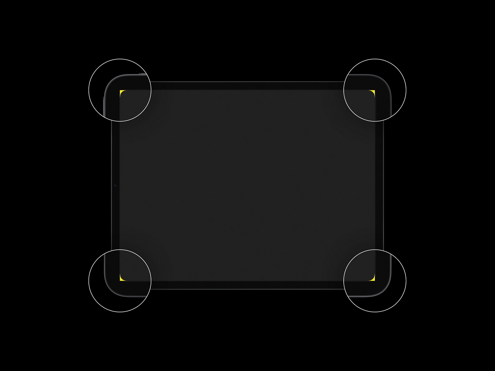
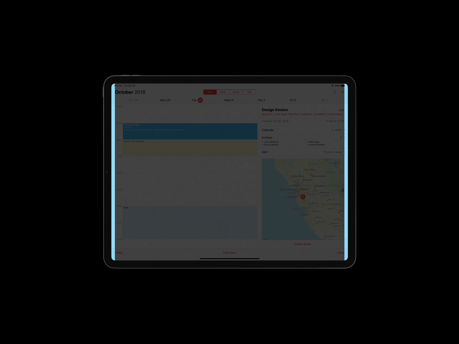
As with current generation iPhone devices, the corners are rounded on the display. Avoid placing UI elements or content close to the edges of these corners. For many apps, the status bar, navigation bar, toolbar and tab bar will inset elements appropriately.
Safe Area Layout Guides
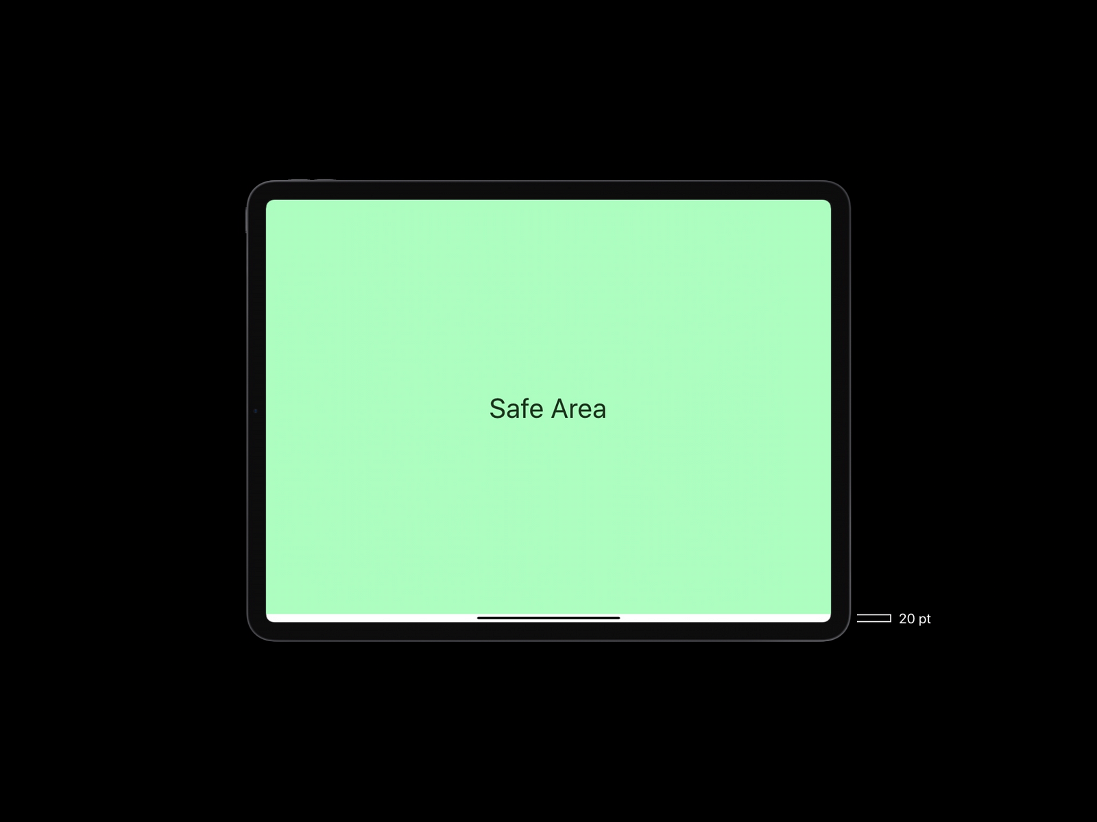
Safe area layout guides are your friend. These prevent your content from getting clipped by the rounded corners. The bottom safe area inset prevents content from being covered by the home indicator. This inset is exactly 20 pt in height in both landscape and portrait orientation. The status bar is taller at a 24pt inset.
Layout Margins
Layout margins help add margins on the left and right edges of the screen. This can help you provide more breathing space to your app content and the display’s left and right edges.
These margins come in handy when aligning elements in the navigation, tool and status bar. The width of the margin varies based on the size class of the device. This can help you specify different margin sizes for different screen sizes. For ‘Regular’ the default margin is 20 pt and for ‘Compact’ the margin is 16 pt. Click here for more on size classes.
Pesky Black Bars
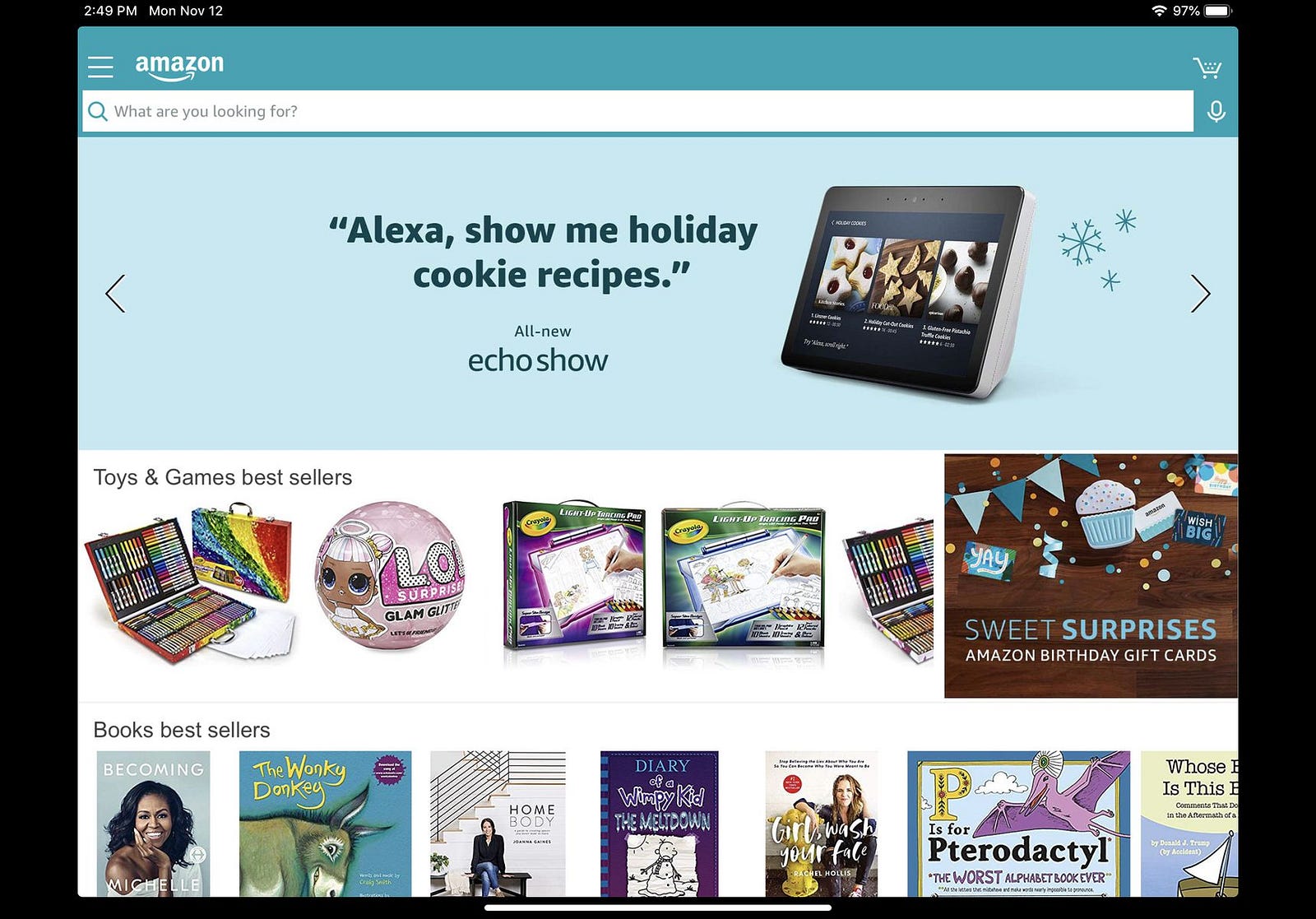
Most iPad apps have been built for 4:3 aspect ratio. The new iPad Pro has a wider aspect ratio. The current design of your app may show black bars on the left and right edges of the new iPad. If the content is filled to the edges it may clip the content at the rounded corner. This is an update a lot of big apps like Netflix and Amazon are making so that their apps fill the entire screen correctly.
Your content needs to be able to adapt to the new iPad screen to use up the entire screen without clipping any content. This is where the safe area layout guides come in handy.
Double Tap: The Pencil
The new pencil has all the features from the previous generation Apple pencil and then some. You can use pressure and force on the screen to use different stroke thickness and color opacity for example. When you tilt the pencil the device registers the altitude and the azimuth to recognize when you are shading instead of drawing a line. These features have been ported over as is from the previous Apple Pencil.
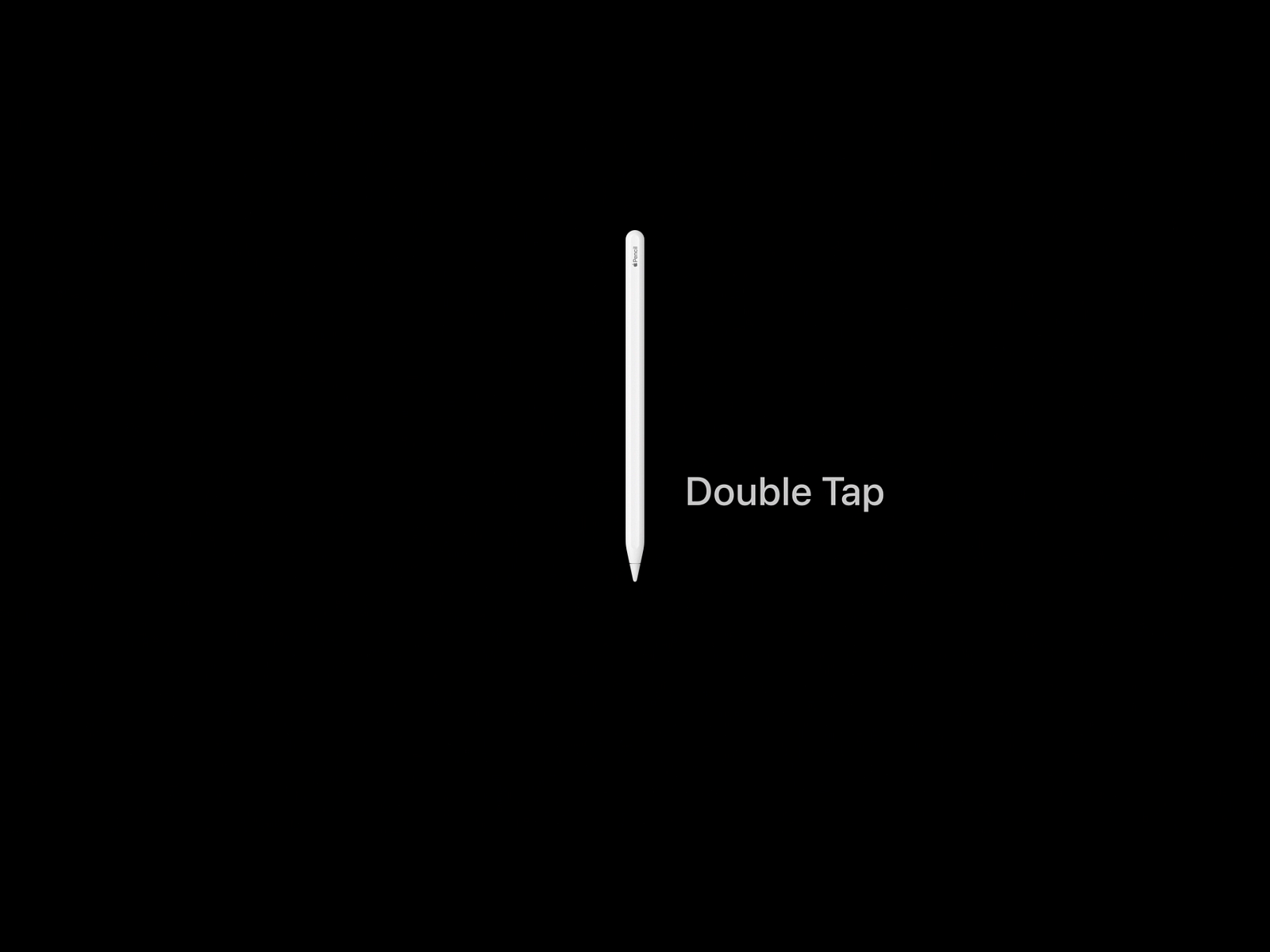
The big new feature is the double tap on the pencil side. This is customizable by the user in the Settings app. There are currently four system options for the double tap.
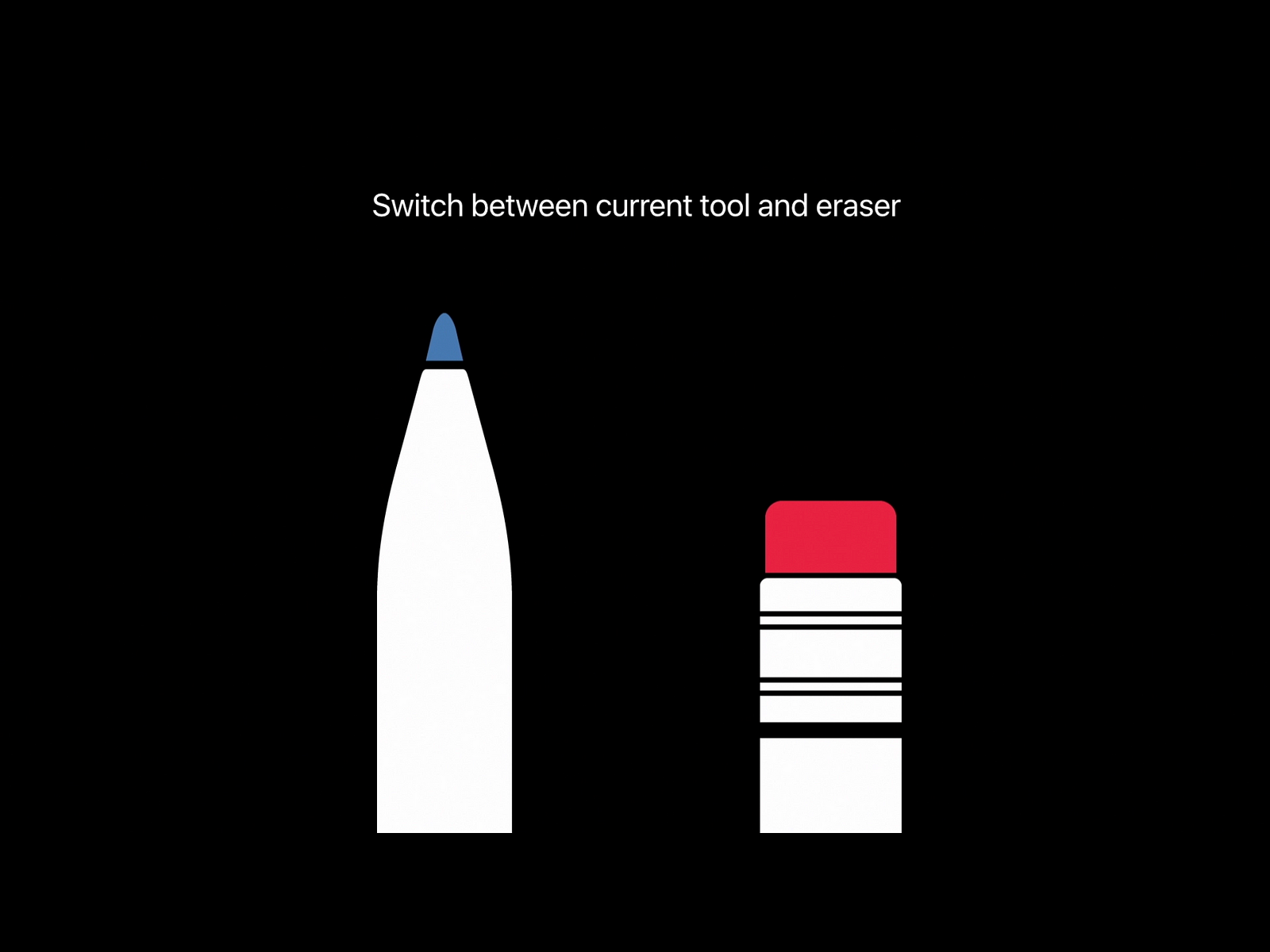
- Switch between the pencil tool and the eraser tool.
- Switch between the current tool and the last used tool.
- Show a color palette.
- Turn the double tap gesture off.
You can customize what the double tap gesture does in your app. To ensure you add value for the user consider the following experience guidelines.
If the user has disabled the double tap gesture at the iOS system level your app should not do anything either. A user expects the system settings to be globally prevalent.
Try to ensure your app can follow the system settings as much as possible. For example, if the user has opted to switch between the pencil and eraser tool, your app tools should switch the same way. People will expect your app to mirror the decision they made in the system settings, contradicting that setting can make your app feel less intuitive.
If you must have a custom double tap feature specific to your app make sure it is opt-in and not enabled by default. Introduce this toggle in your app settings to give the user the choice to use your custom double tap behavior.
Your app should provide clear visual feedback when the user double taps the apple pencil. Double tapping should not provide any critical functionality that isn’t accessible through your app’s interface.

No comments:
Post a Comment